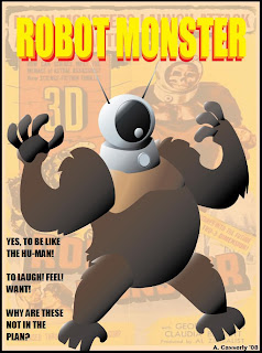
From the 1956 classic of confusion (God, I love this movie).
Any Adobe Illustrator users out there want to nitpick this one? I could use some advice.
Imagination Lab. This is an artistic space for creativity, fun, inspiration, collaboration, and growth; all coming from an Illustration/Animation point of view. As often as we can, we will practice our skills with new design exercises. Execution of the designs can be in any style or genre - anything goes. We're here to help each other grow as artists and keep things fresh. Hope you enjoy...
4 comments:
I would just say that radial gradients might have worked better then the linear ones you used. I usually try to avoid gradients as much as possible because the tend to look generic. look up "Mesh Gradient" if you want to manipulate a gradient to the contours of an object.
Sweet, you're learning illustrator? I'm thinking of taking a class at deanza next semester.
Thank you, Senor Roth. As Gustlin would say, my gradients are looking kinda' ASSY! (as for YOU, Ariel...I just went to my local library and checked out a book on Adobe Illustrator. I'd rather not waste any more time or money on school!)
Post a Comment